Sometimes a PowerPoint presentation may be the majority of your course content. If that is the case, you want to be sure that you have the best PowerPoint you can. Stop creating those outdated presentations and impress your students with these 5 basic design tips.

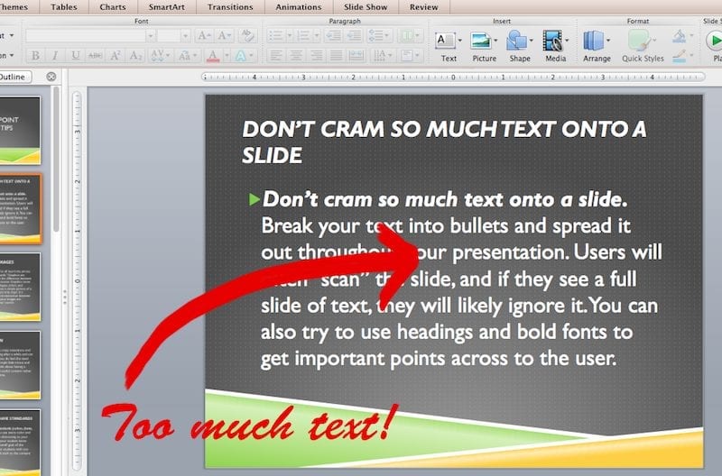
- Don’t cram so much text onto a slide. Break your text into bullets and spread it out throughout your presentation. Users will often “scan” the slide, and if they see a full slide of text, they will likely ignore it. You can also try to use headings and bold fonts to get important points across to the user.
- Use meaningful images. We’ve all heard the phrase “a picture is worth a thousand words.” Graphics are training tools and can often be the difference between an average course and a great course. Graphics come in a variety of different sizes, shapes, colors, and complexities. They are more than a simple picture of a person or place. Images often portray steps in a process, pieces of a concept, and interaction between people and emotions. Be sure your images are meaningful and add value to your course.Big Stock Photo, iStockphoto, and Shutterstock are three great resources, full of quality images!
- Use less animation. Adding crazy transitions and animations can grow annoying after a while and can often time be pointless. If you do feel the need for animations, limit it to a simple fade in/out and only use when necessary. Think about having a great PowerPoint design and useful content rather than adding fluff to your course.
- Create a master template. It is important to be consistent and have standards (colors, fonts, sizes, layout, design). If you use every color and every font possible, it can be distracting to your readers. Standards can help your student know what is important and the overall goal of the course. Avoid distracting your students with too many fonts or colors, instead stick to the content itself.
- Add audio or video recordings. Adding audio to your presentation is a great way to shorten the amount of text on the slides. Your bullet points can be concise because the audio portion provides all the examples and elaboration necessary. Another option is inserting a video to your slides, whether it is your recorded lecture or a YouTube example. A video can add interest and breakup the mundane material for your readers.These are some great tips on recording audio and a few affordable tools to get you started.
Hopefully with these 5 basic design tips, you can create your best presentation yet! Not ready to buy? Try OpenOffice – a free open productivity suite!